%20(1200%20x%20237%20px)%20(300%20x%2059%20px).webp)
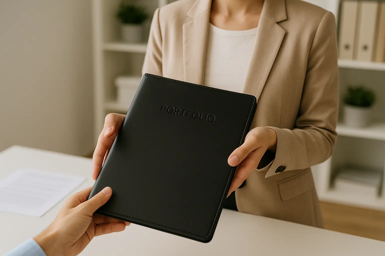
Portfolio Tips for Planning Students
No one got into planning because they wanted to build a PDF.
But here you are staring at a blank screen (well, actually, this article…but for the sake of imagery, you’re staring at a blank screen), wondering if you should list that sidewalk audit you did in undergrad, or whether your senior studio map of downtown can somehow become “print-worthy.” Well, here’s some good news (how often do you hear that these days). You don’t need a perfect portfolio. You just need a smart one.
Here's what matters:
Know What Kind of Planner You’re Aiming to Be
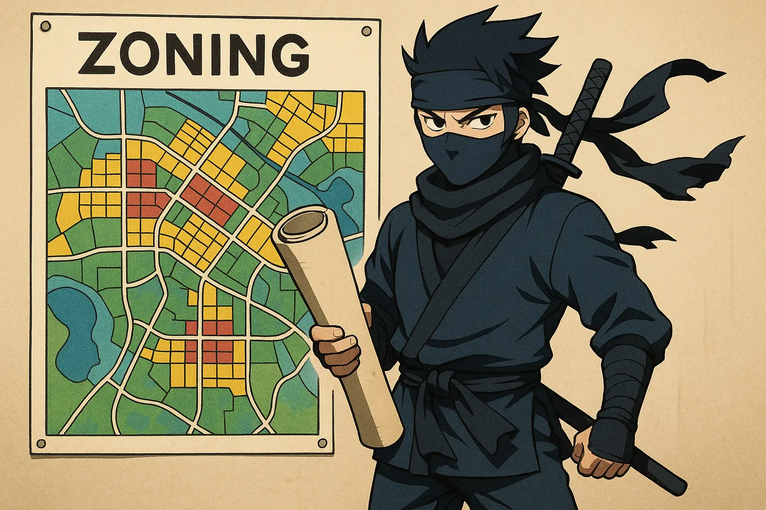
Not every portfolio is created equal. Are you going into urban design? GIS? Policy analysis? Community engagement? Transportation? Planning is a broad field and there are many opportunities for specialization. Because of this, it’s important that your portfolio reflect the kind of work you want more of. If you want to be a zoning ninja, show zoning work.
If you want to build beautiful streetscapes, show renderings, plans, and graphics. If you want to go into transportation…trains….all of them. (CHOO CHOO LETS GO!).
Quality Over Quantity
This isn’t a buffet, it’s a curated tasting menu. And your “dishes”? Top-notch, high-end restaurant stuff. Don’t make Dave Ramsey come after you for serving up a bloated PDF.

3 to 5 solid, well-presented projects are way better than 15 half-baked ones. Choose pieces that show your range, are visually clean, easy to scan, and let your thinking shine through, not just the final product.
Think of it like an elevator pitch. You’ve got 15 seconds to catch someone’s attention and you're not going to launch into zoning overlays and transportation acronyms. You’re going to give them your best, quickly and clearly.
And guess what? That portfolio reviewer? They might only give you 15 seconds too. Make them count.
Make it Visual (Even the Boring Stuff)
In my service industry days, I noticed one universal truth: people don’t read signs.
Why? Because they have words. People are visual and like pretty pictures. The more visual the sign, the more likely it is to actually get noticed.
Planning is often data-heavy, but your portfolio shouldn’t feel like a PowerPoint from a 2003 MPO meeting or like one of those signs no one reads. (And please, please don’t PowerPoint your portfolio to death. If every slide is a wall of words, it’s a no from me.)
Use icons. Use maps. Use diagrams. Use bold section titles. Even policy work can be visual if you show how you structured a code rewrite or mapped out community feedback.
If it looks like a Word doc... fix that. You’re not writing a report, you’re showing your work.
Context Is Everything
A pretty map or rendering is nice. But context? That’s what makes it meaningful.
Each project in your portfolio should come with a short, clear explanation. Nothing long-winded, just enough to help someone understand what they’re looking at and why it matters. Think of it like writing captions: informative, but not overwhelming.
Here’s what to include:
- What the project was
Give a quick overview. Was it a studio project? A real-world plan? A neighborhood analysis? A rezoning effort? Set the stage in one or two sentences. - What your role was
Be honest and clear. Did you lead the effort, collaborate on a team, or contribute a specific piece (like mapping, writing, engagement)? Don’t oversell, but definitely don’t undersell either. - What tools you used
ArcGIS? SketchUp? Excel? Miro? Prayer? Listing your tools not only shows your skills but it also gives a sense of your process. What the outcome was? Did it get adopted? Did it inform a decision? Did it spark community input? Even if it didn’t go beyond the classroom, what did you take from it?
Add that context, and suddenly your portfolio doesn’t just say “I did this”, rather it says “Here’s how I think, how I work, and how I contribute.”
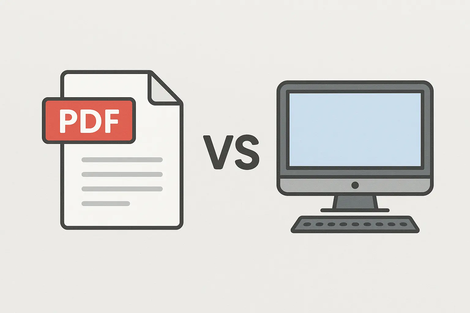
PDF vs. Web Portfolio
PDFs are still the norm for most planning jobs. They’re portable, easy to share, and simple to review. But if you’re leaning toward urban design, data storytelling, or anything visual-heavy, consider building a simple web-based version (Webflow, Wix, etc.). It gives you a chance to showoff your digital fluency, and it’s way easier to update.
Progressive firms and municipalities (ehem… the cool places to work) are often looking for people who are comfortable in digital spaces. Someone who knows their way around a mouse and a keyboard.
(Preferably not a real mouse.)
Show off those skills. They are, in fact, impressive.
Bonus: It gives you something sleek to drop on LinkedIn.
Include a Tools/Skills Section
Even if it’s simple, include a sidebar or callout that highlights your tools and skills. List any software you’ve worked with like GIS, Adobe, SketchUp, whatever applies. Add methods too: public engagement, zoning analysis, comp plan reviews... you get the idea.
And don’t overlook your soft skills.
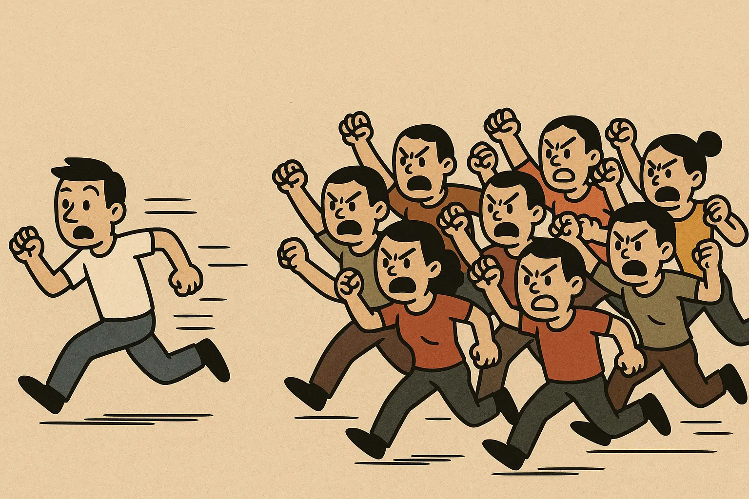
Have you wrangled 10 angry residents and made it out alive?
That’s not just a win, that’s talent. Put it in.
Treat It Like an Interview
Remember when I said your portfolio is like your 15-second elevator pitch?
Well now, think of it like an interview.
Every part of your portfolio should answer one big question:
“Would I want to work with this person?”
…Well? Would you?
Would you want to work with yourself?
Would someone else? Why? Let them know.
(And just to be clear. The answer is yes. Yes, you would. Because you… are… awesome.)
Make it easy for your reviewer to agree with you.
Make it easy to read. Make it feel like you.
And please, put your name and contact info on it.
(You’d be surprised how many people forget that part.)
Last Word from the ZOP Sidewalk
Your portfolio isn’t just a showcase, it’s a signal.
It tells people you know your stuff.
It shows that you care how your work is seen.
And it proves you’re thoughtful about how you show up in this field.
So, take a breath. Start where you are. Clean it up.
And when in doubt: less clutter, more clarity.
You’ve got this.
A portfolio is essential — but so is knowing what tools can actually make it better.